Principles of Beauty Design #0: Intent
- Jennifer Carlsson

- May 21, 2025
- 3 min read
Updated: Jul 2, 2025

Why This Series Exists
This series is about the fundamental principles that shape great beauty packaging design. It’s based on how I approach design—through research, refinement, and intentionality—and shaped by my years of helping beauty brands craft packaging that resonates.
Whether you're a designer or a beauty founder, my goal is to help you sharpen your eye, understand what makes design work, and most importantly—design with intent.
Why Beauty Design Is Different
While these principles apply to all kinds of visual design, this series is written specifically for beauty packaging—a category where visual choices carry immense emotional and strategic weight.
Beauty packaging often has to do a lot with very little. In today’s landscape, minimalist design dominates. That might seem simple, but it’s often far more challenging to execute. When a design relies on just a few elements—type, layout, colour, spacing—every detail has to be flawless. There’s nowhere to hide.
The Power of Intentional Design
Good design is never random. Every decision should serve a purpose: to express a brand’s values, appeal to a specific audience, or create a particular emotional tone.
Intent is what separates pretty packaging from powerful branding.
When you’re intentional, typography isn’t just about legibility—it’s about voice. Colour isn’t just aesthetic—it’s psychological. White space isn’t empty—it’s full of meaning.
This is especially important in beauty, where packaging often has to:
Compete visually on a crowded shelf or feed
Communicate a brand’s tone at a glance
Evoke emotion and trust in a saturated market
Examples of Design Intent in Action
Here are a few beauty brands that demonstrate intentional design—where every visual choice supports their brand philosophy, product strategy, or consumer experience:

Crown Affair embraces minimalism not just as an aesthetic, but as a reflection of their product philosophy. Their shampoo, for instance, is labelled simply: “Crown – The Ritual Shampoo” in large type. There’s no clutter or claims—because there’s only one shampoo in the line, and this is it. The design reinforces a curated, intentional routine.

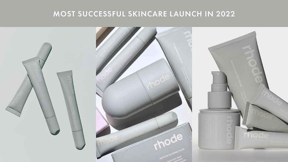
Rhode uses a muted, monochromatic grey palette with discreet white text, projecting calm confidence and clinical chic. While the colours are uniform across the range, each product is differentiated by its unique shape, making them easy to tell apart. This balance of restraint and usability reflects Rhode’s modern, design-led approach.

By Wishtrend leads with its ingredients—literally. Each line features a distinct, high-contrast colour scheme and places the key active ingredient front and centre on the packaging. This makes it immediately clear what the product is for, and signals transparency and efficacy to ingredient-savvy consumers.
What to Expect in This Series
In the coming posts, I’ll walk through each of the core design principles—one at a time. I’ll explain what they mean in practice, show you how to spot them in real-world packaging, and offer ways to experiment with them in your own work.
This is a series about learning to see, not just how to make.
We begin here with intent—because every great design decision starts with understanding what you’re trying to say.
Post Directory
Here you can find a preview of the first topics that will be covered and once they have been posted I will add the links here. New post goes up once a week on Wednesdays.


Comments