Principles of Beauty Design #4: Proximity
- Jennifer Carlsson

- Jun 18, 2025
- 4 min read

Proximity: Reading Between the Spaces
Proximity is one of the simplest yet most powerful principles in design. It refers to the spatial relationship between elements—how close together or far apart they are—and how that distance shapes the way we interpret what we see.
In beauty packaging, proximity quietly guides how we read and understand a design. It tells us which elements belong together, what should stand out, and where to focus our attention. Often, proximity does this more effectively than graphic dividers or lines—it relies on spatial logic rather than visual noise.
Used well, proximity creates hierarchy, clarity, and rhythm. Used poorly—or without intention—it leads to clutter, confusion, or missed opportunities to communicate meaning.
This post explores how proximity works in practice and how you can use it to bring structure and strategy to your own packaging design.
Closeness Implies Connection
When text or visual elements are grouped closely together, we automatically perceive them as being related. This applies not only to text blocks like product names and descriptions but also to how typography is paired with other graphic or structural elements.
If the brand name, product name, and category label are all tightly grouped, they read as a single unit. If one of them is spaced further away, it signals separation—sometimes hierarchy, sometimes a shift in function.

Example: Mamonde
On this Mamonde serum, the text “Bakuchiol Serum” is followed immediately by a secondary line: “Boosted With 95% Pure Retinol.” The close proximity of these two lines tells the viewer that this claim is directly related to the Bakuchiol Serum formulation—not to the product name or any other element.
If this supporting claim had instead been placed closer to the product name, “Pore Shrinker,” it could easily have caused confusion—making it unclear whether the 95% pure retinol refers to the serum’s function, the product name, or even a separate product line.
By grouping related information together, Mamonde’s layout maintains clarity and avoids miscommunication—a subtle but important use of proximity.

Distance Creates Focus
Conversely, placing an element further away from others gives it more visual weight. When something is isolated, it naturally draws attention—our eyes are pulled toward the element that breaks the visual rhythm.
This is a common technique when brands want to emphasize the brand name or create a sense of elegance and space.

Example: Plenaire
Plenaire uses a large, bold sans serif for its brand name, placing it at the top of the tube with ample white space before the next cluster of information appears. Below, the product type and other copy are much smaller, lighter, and grouped closely together.
This contrast in size, weight, and spacing reinforces a clear hierarchy and visually communicates that the brand identity is distinct from the product information. The space also adds a sense of calm and minimalism to the design.

Proximity as Informational Logic
Beyond just creating visual balance, proximity can also be used to convey functional information—especially when combined with physical packaging elements like colour blocking or materials.

Example: Glossier – Cloud Paint
Glossier’s Cloud Paint blush cleverly uses proximity and placement as part of the storytelling. The design mimics a Pantone swatch or paint tube, reinforcing the product’s playful, pigment-focused identity.
The shade name, like “Puff,” is placed in the middle of the colour-dipped section of the tube. This makes it instantly clear that this is the name of the shade, not the product name or brand. Its placement directly on the colour reinforces that relationship and makes it intuitive for the user.
When Proximity Breaks Down
When proximity isn’t considered intentionally, it can lead to confusion or miscommunication—even if the layout technically looks neat.

Example: Haleys – Re-form Foundation
Haleys’ Re-form Luminous Skin Foundation also uses a colour-dipped tube, but in this case the colour block doesn’t correspond to the product’s shade. Instead, the actual shade is shown through a small clear window, and the colour-dipped section simply holds the brand name.
Visually, this creates a false association—a viewer might assume that the colour-dipped section indicates the shade, as in Glossier’s design. This disconnect happens when aesthetic cues are borrowed from other brands without applying the same logic or intent behind them.
Design With Intent
Proximity is not just about creating order—it’s about communicating relationships. When you place elements closer or further apart, you’re making a statement about how they relate, what matters more, and how the design should be read.
Understanding this lets you go beyond copying layouts and instead make strategic decisions that align with your product, your brand voice, and your customer’s expectations.
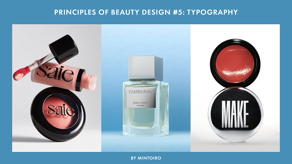
Next: Typography
In the next post, we’ll build a foundation for working with typography by defining the core terms and categories every beauty designer should know—from font styles and weights to contrast and case. Understanding this shared vocabulary will help you make more intentional type choices and set the stage for exploring typography in more depth later in the series.


Comments