Principles of Beauty Design #3: Alignment
- Jennifer Carlsson

- Jun 11, 2025
- 5 min read

The Invisible Order Behind Good Design
In the last post, we explored spacing—how the distance between elements and letters affects clarity and tone. In this part, we’re moving into alignment, one of the most foundational principles of design that often goes unnoticed when it’s done well—and stands out when it isn’t.
Alignment refers to the direction or edge to which your text or visual elements are anchored. It brings structure, order, and cohesion to a design. Without consistent alignment, even well-spaced, well-styled text can look chaotic or amateurish.
Horizontal Alignment
Horizontal alignment refers to how text or elements are aligned left, right, centre, or justified across a horizontal axis. Each choice gives a different feel and is often tied to a brand's aesthetic direction.

Align Centre – The Beauty Industry Default
Cantered alignment is by far the most common alignment style in beauty packaging. It feels balanced, intentional, and calm—qualities often associated with skincare, fragrance, and wellness products.

Matiere Premiere – Centre-Aligned with Balanced Hierarchy
Matiere Premiere uses a centred layout that feels carefully calibrated. The brand name, product name, and category are stacked in the classic beauty format: top (category), middle (product name), bottom (brand). Each line is centred and spaced with restraint, emphasizing simplicity and legibility. This approach supports their positioning as a modern luxury fragrance brand — clean, refined, and minimal without being sterile.

Crown Affair – Centred and Elevated
Crown Affair uses centred alignment with generous spacing and a strong vertical structure. The brand name sits at the top, and the product descriptor is centred near the bottom, creating a symmetrical hourglass shape. The alignment feels deliberate and confident, communicating a sense of calm luxury. Because they only offer one version of each product, they don’t need to crowd the packaging with variations or extra labels — the minimal centred layout amplifies that clarity.

Laneige – centred and Symmetrical
Laneige uses a highly centred alignment for its Water Bank line, balancing the brand and product name along the middle axis. The alignment reinforces their clean, clinical-cute hybrid look — approachable but refined. This type of symmetry is common in prestige K-beauty brands and communicates trust and stability.

Align Left – Minimal, Clinical, or Editorial
Left-aligned text is often used for brands that lean apothecary, minimalist, or editorial. It can feel clinical, modern, or grounded depending on typography and spacing.

Dossier – Left-Aligned for an Apothecary Look
Dossier’s fragrance packaging adopts a left-aligned layout, which reinforces its clinical, apothecary-inspired identity. The alignment immediately gives the label a more utilitarian tone. Note how the hierarchy is still maintained, with the product name bolder and in color to draw attention, while the descriptive text and brand name remain secondary. This visual coding reinforces function-first minimalism.
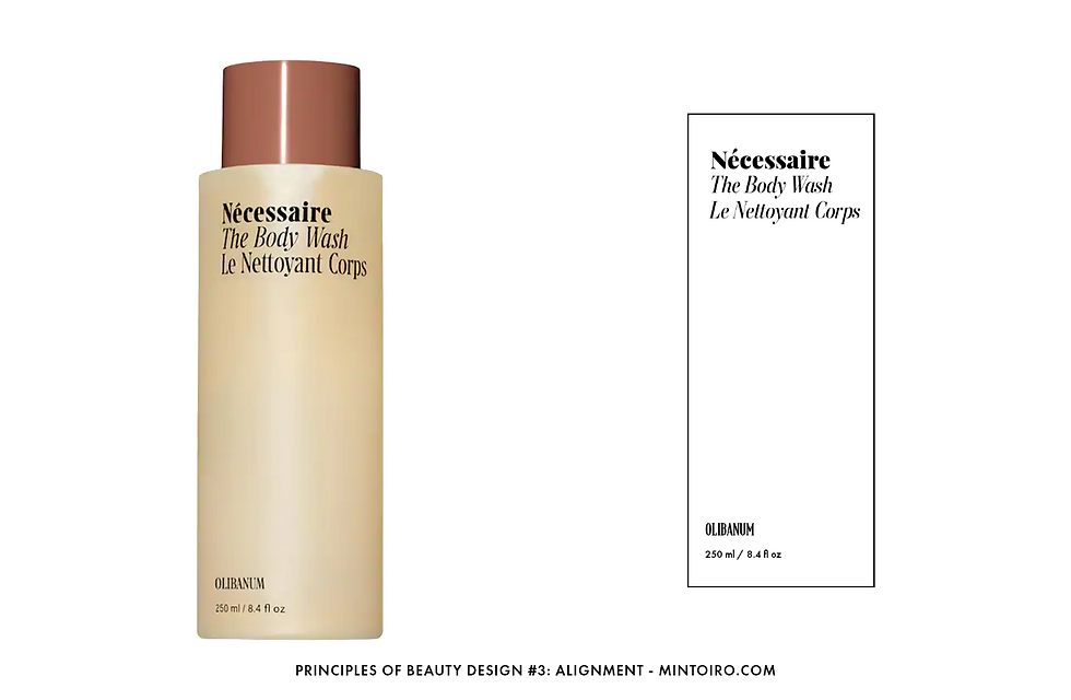
Nécessaire – Left-Aligned Editorial Style
Nécessaire aligns all of its front-facing text to the left, reinforcing its editorial and ingredient-first aesthetic. The alignment feels intentional — like text on a book cover — and supports a more serious, self-care-meets-clinical vibe. Their serif font adds contrast and gravity, showing how alignment can also support a more elevated tone.

Glossier – Left-Aligned for Editorial Impact
Glossier’s “Solution” packaging uses a fully left-aligned layout, including the brand name, product name, descriptive copy, and ingredient percentages. This approach reinforces the brand’s editorial, utilitarian feel — as if the label was lifted straight from a magazine spread or skincare guide. The strong left alignment helps ground the design while keeping it clean and accessible, staying true to Glossier’s casual, modern, and user-first aesthetic.

Align Right – Experimental or Sophisticated
Right alignment is uncommon in beauty and usually signals a design-forward or intentionally unconventional brand. It can feel elegant or unexpected—but it must be handled carefully.

Darling – Right-Heavy Minimalism
Darling’s packaging also uses a loose right alignment. The product name and category are aligned to the right edge, and the large round cap balances the empty space on the left. This layout feels fresh and modern, contributing to the brand’s playful, colourful aesthetic without sacrificing minimalism.

Frama – Right-Aligned with Tension
Frama’s packaging is striking because of its unusual right-aligned layout. The bulk of the product text sits on the left label, but the brand name floats in the lower right corner, detached. This creates visual tension and makes the design feel more avant-garde. Right alignment can be difficult to execute well, but Frama uses it to create a sense of architectural sophistication.

Justified – Rare, but Occasionally Used for Structure
Justified alignment (where text is evenly aligned along both left and right edges) is rarely used in beauty, but can add a structured, grid-like feel when done intentionally. It works best in short bursts of text like ingredient callouts or product info.

Henry Rose – Justified with Intentional Structure
Henry Rose takes a more unusual approach with a justified layout that aligns the product name “Jake’s House” along invisible left and right bounds, splitting the name into two separate words across the top. The brand name, Henry Rose, appears on the opposite side of the bottle and is seen centred through the clear glass, visually layered between the top and bottom text. This design choice introduces a subtle tension, creating a structured but slightly unconventional layout that feels deliberate and modern — a sophisticated way to stand out while maintaining clarity.

Glow Recipe – Justified for Dense Text
Glow Recipe’s packaging uses justified alignment to deal with longer product names and descriptions. Their cleansing balm, for example, has line breaks that are carefully spaced to maintain a compact, justified shape. This keeps the label feeling structured and avoids the ragged edges that looser alignment might create. It also reflects the fun-but-formulated tone of the brand.
Vertical Alignment
Vertical alignment refers to how elements are positioned top, centre, or bottom along the vertical axis of the packaging. While harder to spot, it’s a subtle but important detail—especially when text is variable in length.
You often can’t see the text box a designer used, but you can look at multiple variants of the same product to get clues.

Example: Phlur's Product Name Placement
Look at several Phlur perfume bottles. On versions where the product name is one line, the text is aligned with the top of the two-line version. This tells us the product name is top-aligned within its text box. Noticing these small alignment decisions helps you understand how designers preserve consistency across a range.
Why I Recommend Centre Alignment When Designing
When I’m building a beauty packaging layout—especially one that will have product variations—I always use centre-aligned, bounded text boxes. This method makes it easy to create a consistent, adaptable grid. It gives you a clear visual anchor and reduces spacing errors when text length changes across SKUs.
If you just place free-floating text without alignment boxes, it’s easy for elements to drift out of place, leading to messy or inconsistent layouts—especially across a product line.
This might seem like a small detail, but it makes a huge difference in the polish and professionalism of your design. Over the years, making this a habit has saved me time, improved consistency, and helped me build cleaner, more thoughtful packaging systems.
Next: Proximity
In the next post, we’ll look at proximity—how grouping related elements together helps communicate structure, build visual relationships, and create clarity in even the simplest layouts.


Comments