Rebranded Beauty: Tree Hut
- Jennifer Carlsson

- Mar 17
- 8 min read
Updated: Mar 19

A Case Study of Tree Hut’s 2025 Rebrand
Tree Hut introduced a full visual rebrand in 2025, updating its logo, packaging graphics, and overall brand presentation across its product lineup. For a brand that has long been a staple of scent-driven bodycare, the redesign marked a significant shift in how Tree Hut appears on shelf while leaving the products themselves largely unchanged. This post takes a closer look at the redesign, examining what changed, how the new visual system works, and where it succeeds or struggles. And of course I have what you all came for; side by side comparisons of the old and new packaging.
This article is part of the Rebranded Beauty series, where I analyze beauty brand redesigns through the lens of visual identity and brand strategy. Each post compares the old and new design systems, breaking down elements such as typography, colour, layout, packaging architecture, and photography to understand how the rebrand changes the brand’s positioning and overall presence.
Tree Hut also appears in my Skincare Trend Forecast 2027–2028 Report, where it is discussed as a brand to watch within the growing scent-driven bodycare segment. The category has expanded rapidly in recent years as fragrance, texture, and sensorial payoff become central to everyday routines, making Tree Hut’s continued momentum particularly interesting in the context of broader market shifts.

A Scent-Driven Bodycare Brand That Outgrew Its Packaging
Tree Hut has built long-standing recognition around colourful, fragrance-driven bodycare, with its Shea Sugar Body Scrubs becoming one of the most widely recognizable products in the category. The brand helped normalize exfoliating bodycare as an indulgent everyday ritual rather than a niche treatment, positioning body routines closer to fragrance and pleasure than to clinical efficacy. Over time the assortment expanded beyond scrubs to include body butters, oils, and washes offered across a wide rotation of scents ranging from coconut and tropical fruits to dessert-inspired gourmands and fresh florals. Instead of anchoring the brand to a single hero fragrance, Tree Hut treats scent as modular and collectible, encouraging consumers to switch between moods, seasons, and routines.
This approach has proven highly durable. Tree Hut maintains strong visibility across both Instagram and TikTok, where vibrant colours and scent-led storytelling translate naturally into short-form content. Rather than relying on occasional viral moments, the brand’s momentum comes from consistent discovery and repeat purchasing, driven by seasonal launches and an ever-expanding scent wardrobe. At mass retail scale, with distribution across retailers such as Ulta Beauty, Boots, Douglas, Lyko and many more, Tree Hut functions as one of the most recognizable anchors within the scent-driven bodycare segment.

Commercial Success, Outdated Identity
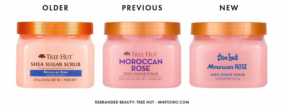
Despite Tree Hut’s strong commercial performance, the brand’s visual identity had gradually begun to feel outdated. Over the years the company refreshed its packaging several times, yet one central element remained largely unchanged: the logo. The previous identity relied on an all-caps serif wordmark paired with a tree icon, which gave the brand a slightly traditional and serious tone that sat somewhat awkwardly alongside the playful nature of the products themselves.

Earlier iterations of the brand were centered primarily on the concept of shea-based exfoliation, with the original Shea Sugar Scrubs initially offered without fragrance variations. As scented options proved increasingly successful, the packaging evolved to place greater emphasis on scent names and flavour-inspired identities. Over time this shift led to labels that frequently incorporated photography directly into the design, often featuring images of fruits or ingredients as visual scent cues.
While this approach communicated fragrance effectively, it also produced a visually busy system. Photographic backgrounds, mixed typography, and the relatively formal logo created a lack of cohesion across the product lineup. The overall result was a brand that often appeared inconsistent and stylistically dated. For a product range built around vibrant colours, joyful textures, and playful scents, the visual identity never fully captured the energy of the products themselves.

A Full Packaging Overhaul for a More Playful and Modern Brand
In 2025 Tree Hut introduced a comprehensive redesign across its entire product portfolio, unveiling a new logo, updated packaging graphics, and a broader shift in the brand’s visual tone. According to the brand, the goal was to create a look that felt brighter, more playful, and “unmistakably us.”

The redesign coincided with the launch of the “Uncontain Yourself” campaign, which frames Tree Hut as a brand centered on joy, self-expression, and sensorial self-care. Rather than repositioning the brand or altering its core offering, the rebrand focuses on modernizing the visual language so that it better reflects the playful and indulgent nature of the products.
Crucially, the brand retained the elements that had already proven successful. The formulations remain unchanged, the rotating lineup of fragrances continues to expand as before, and pricing remains firmly accessible. In this sense, the rebrand functions less as a strategic pivot and more as a visual recalibration, bringing the brand’s appearance closer to the experience consumers already associate with the products.

A New Logo Built Around Texture and Playfulness
The most immediately noticeable change is the new logo. The previous serif wordmark has been replaced with a bold lowercase display typeface that feels significantly more modern and youthful. The rounded letterforms create a friendly and approachable tone, introducing a slightly retro and almost groovy character that contrasts sharply with the more traditional identity that came before.

According to the brand, the shape of the lettering is meant to evoke what Tree Hut calls “goop pulls,” the long stretch of product that forms when scooping their signature sugar scrubs from the jar. The reference reinforces the brand’s focus on texture and sensory experience, linking the logo conceptually to the tactile qualities of the product itself.

Typography across the packaging has also been refined. Tree Hut continues to use a variety of fonts to highlight scent names, often pairing multiple type styles within a single design. However, the selections now feel more controlled and intentional than before. While the system remains expressive, the updated typography appears more standardized across the product range, creating a typographic language that feels playful but less chaotic than the previous designs.

From Photographic Chaos to a Cleaner Graphics
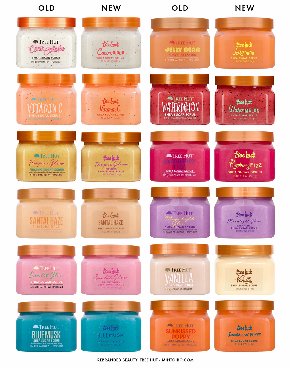
One of the most noticeable improvements in the redesign is the shift away from photography-heavy packaging. Earlier versions frequently combined bright colours with photographic images of fruits or ingredients, producing labels that often felt visually crowded and inconsistent across different scent variants. While these images helped communicate fragrance cues, they also contributed to the visual noise that characterized much of the previous design system.

The new packaging replaces these images with simpler graphic backgrounds, including flat coloured graphics and stylized patterns. This immediately creates a more cohesive visual system. Each product still retains a distinctive colour identity, helping consumers quickly recognize different scents, but the overall palette now feels more controlled and intentional. Typography on the front of the jars has also become more unified. Instead of mixing multiple competing colours within the same label, text elements are now more likely to share a single colour, improving legibility while reducing visual clutter.

The strongest designs are the ones that lean into clean, graphic patterns or flat illustrations, where the background provides clear separation from the text. These allow the scent name and logo to remain readable without competing with the background. Some variants, however, introduce gradients or softer blurred elements that start to echo aspects of the previous packaging style. In those cases the background once again competes with the typography, suggesting that a fully graphic approach would have created a more consistent and confident visual system across the range.
Familiar Packaging With a More Polished Visual System
Although the graphics have changed significantly, Tree Hut wisely retained its recognizable packaging architecture. The signature wide jars and the brand’s golden-brown caps remain unchanged, preserving the physical shelf presence that consumers already associate with the brand.
The layout structure of the labels is also largely consistent with previous versions. However, the simplified colour palette, updated typography, and removal of photographic backgrounds dramatically improve the visual clarity of the packaging.

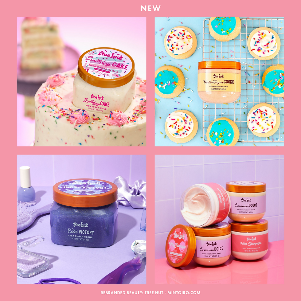
One of the new designs that I personally really like is the brand’s lip butter packaging, where playful typography and graphic backgrounds create a look that feels both contemporary and subtly retro. These designs capture the playful tone the brand appears to be aiming for, demonstrating how the new visual language can work effectively when the elements are balanced carefully.
Cleaner Photography Reinforces the New Visual Direction
The redesign extends beyond packaging into Tree Hut’s broader photography and visual world. Earlier product imagery often relied on highly saturated colours, layered props, and elaborate compositions that could feel visually overwhelming. While this approach emphasized abundance and sensory appeal, it also contributed to the overall sense of visual noise that characterized the previous brand identity.
The updated photography moves in a noticeably more controlled direction. Backgrounds are simpler, colour relationships are clearer, and compositions feel more deliberate. Rather than competing with the packaging, the imagery now supports it. This shift aligns the brand with broader beauty photography trends, where clean compositions and strong colour blocking perform particularly well across digital platforms. Together with the simplified packaging system, the photography helps create a visual identity that feels more cohesive and contemporary while still retaining the playful tone that defines the brand.

A Brand Identity That Finally Matches the Product Experience
Viewed as a whole, the redesign successfully brings Tree Hut’s visual identity closer to the energy of the products themselves. The brand now feels more modern, more playful, and significantly more cohesive, while remaining recognizable to long-time consumers.
An interesting side effect of the redesign is that it subtly softens the overtly mass-market character of the previous packaging. While the products remain accessible in price, the cleaner graphic system and more controlled visual language align the brand more closely with contemporary beauty design trends. On crowded retail shelves, this helps Tree Hut feel more current and intentional rather than simply colourful.
This evolution is particularly important in a category where aesthetics increasingly influence discovery. Many newer bodycare brands compete heavily through design and social-media visibility, meaning that visual clarity has become a key competitive factor. By modernizing its identity, Tree Hut ensures it remains legible to younger audiences encountering the brand for the first time while still preserving the vibrant character that existing customers expect.

When the Logo and Product Name Compete for Attention
Some criticism of the redesign has focused on the new logo, with some observers describing it as overly childish. I do not think the logo itself is the real issue. The wordmark is bold, playful, and well aligned with the personality of the brand. The tension instead comes from how it sits within the overall visual hierarchy. The expressive logo competes directly with the scent or product name, which is also designed to stand out through distinctive typography. When both elements are treated as focal points, the packaging can end up feeling visually crowded.
When brands adopt similarly bold and expressive logos, the design system often resolves this by clearly prioritizing the brand name. The logo becomes the dominant visual anchor while the surrounding typography remains simple and restrained. This allows the brand identity to carry the design while maintaining a clear hierarchy across the packaging.
The opposite strategy is also common. Brands that want to highlight product names or variants typically adopt a more neutral logo so that the product name becomes the primary focal point. In these systems the brand identity remains recognizable but intentionally steps back, allowing the product or scent name to take visual priority.

For a brand like Tree Hut, where fragrance variety is one of the central selling points, this second approach might arguably have made more sense. Because the scents themselves are such an important part of the proposition, a slightly simpler logo could have allowed the fragrance names to take clearer visual focus across the packaging.
A Rebrand That Finally Matches the Strength of the Products
Despite these minor issues, the rebrand successfully brings Tree Hut’s identity in line with contemporary beauty design standards. The packaging now feels far more aligned with the playful, sensorial positioning that has fueled the brand’s popularity for years.
Tree Hut’s continued success also reflects a broader industry movement. Scent-driven bodycare is rapidly becoming one of the defining trends within skincare, as fragrance, texture, and emotional payoff become central to everyday routines.
This shift is explored in greater detail in the Skincare Trend Forecast 2027–2028 Report, where Tree Hut appears as a brand to watch within the expanding scent-led bodycare segment. The rebrand ensures that the brand’s visual identity now matches the strength of the product experience that built its success in the first place.


Comments