Brand Design Study: Selfmade
- Apr 24, 2024
- 5 min read
Updated: Apr 26, 2024

Unveiling Selfmade: A Design Study
Welcome to our Brand Design Study series, where we pull back the curtain on the visual strategies of emergent beauty brands. Today's focus is on Selfmade, a player in the skincare industry that intertwines product design with a message of empowerment and well-being. As we peer through the lens of design, we consider the subtleties that make or break the aesthetic appeal of a brand in a market rich with narratives.
Selfmade's identity is more than a surface-level proposition; it's a dialogue of form, color, and text—each a brushstroke in its larger portrayal of self-care. In this study, we navigate the nuances of its branding, from the playful to the pragmatic, and from the dreamy past to a candid present. Our journey is not just about appreciating design for design's sake but about appreciating how these choices resonate within the industry and among the community Selfmade seeks to serve.
Let us delve into the details that define Selfmade's brand aesthetic, exploring the essence of their visual language as it unfolds across product lines and evolves with time. This is a voyage into design's power to narrate and captivate—where the language of beauty becomes a multifaceted conversation with the self.

The Essence of Selfmade
In the ever-evolving landscape of skincare, Selfmade, founded in the US in 2020 by Stephanie Lee, emerges as a beacon of personal empowerment. This brand intertwines the nurturing of the skin with the nurturing of the self, crafting not just skincare products, but tools for emotional well-being. Selfmade's philosophy goes beyond the surface, aiming to destigmatize mental health and foster a community where self-care rituals are synonymous with self-discovery.
With a commitment to sustainable ingredients, their product formulations address both the physiological needs of the skin and the psychological journey of the individual. Selfmade’s offerings are a nod to nature’s potency and a salute to the informed consumer who seeks transparency and authenticity in their skincare choices.
At the heart of Selfmade’s brand story is a quest to redefine beauty norms, champion inclusivity, and embrace the uniqueness of each person’s story. By placing equal emphasis on mental health and skincare, Selfmade stands out as a brand for whom every product is a pledge of support to their customers’ personal growth and self-care journey, reflecting Stephanie Lee's visionary leadership.

Simplicity and Style: Selfmade’s Logo
The Selfmade logo utilizes a lower-case, bold, and wide sans serif font, with light weight variation and tight letter spacing. The resulting aesthetic is one of playfulness paired with a mature sensibility, capturing a contemporary vibe that speaks to the youthful yet discerning consumer. Its modern flair seems apt for Selfmade's current brand image, embodying the freshness of the company's approach. However, the enduring appeal of such a stylized logo is less certain, posing a question about its adaptability and potential for timeless appeal in the fluid landscape of brand identities.

Palette Play: Selfmade's Color Story
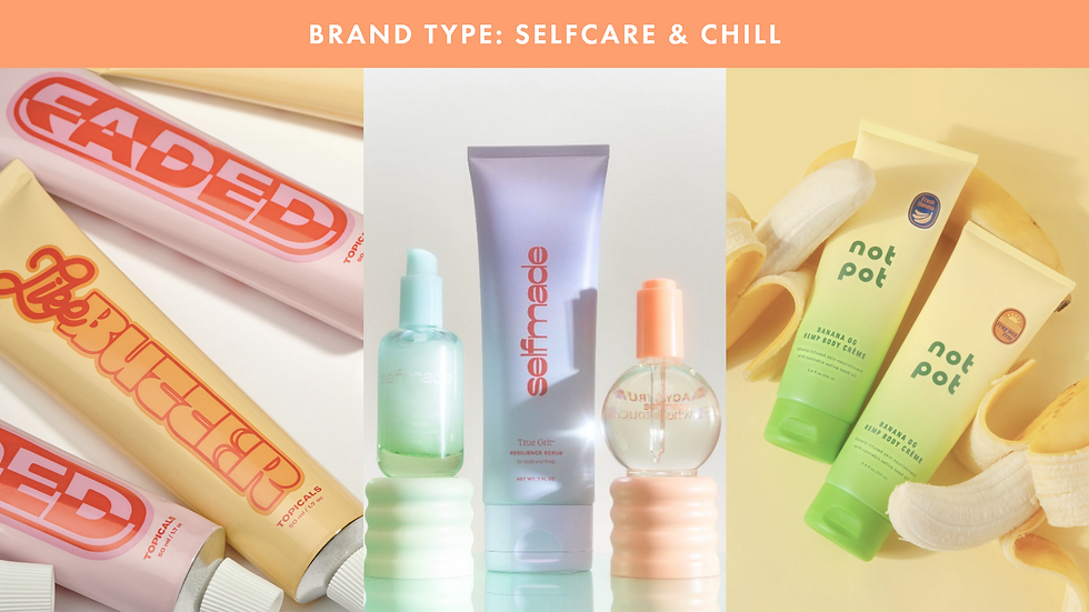
Selfmade's color palette exudes a vibrant and youthful energy, aligning with the current vogue for color gradients that denote relaxation and self-care. The brand thoughtfully employs shades of peach, baby blue, mint green, and lavender—each evoking a distinct mood and resonating with the soothing ethos of the 'Selfcare & Chill' brand archetype.

The Language of Letters: Selfmade’s Typography
Selfmade’s packaging typography employs a combination of serif and sans serif fonts, creating a visual dialogue that, while diverse, borders on the chaotic. The presence of three distinct typefaces, including the logo, introduces a level of complexity that may detract from the brand's otherwise streamlined aesthetic. In design, particularly when a logo is as pronounced as Selfmade's, limiting the variety of typefaces can often strengthen the overall coherence of the brand's visual presentation. Despite this typographic multiplicity, the individual qualities of the type—likely chosen for their individual appeal—do carry a certain stylistic merit, contributing to the brand's unique look and feel.

Form Meets Function: The Selfmade Package
Selfmade's packaging radiates charm with its playful use of color and imaginative shapes, exuding an effervescent appeal. The choice to forgo traditional white caps in favor of colored ones demonstrates a keen eye for detail and a commitment to brand cohesion. This decision significantly elevates the visual impact of the products and enriches the customer's overall experience.
The collection's variety in form and finish is commendable; despite the diversity, there's a clear through-line that unmistakably marks each item as part of the Selfmade product family. Notably, the semi-transparent gradient on the Secure Attachment Comfort Serum is aesthetically delightful, while the cleverly contrasting cap of the Corrective Experience Comfort Cream harmonizes the products. Such thoughtful design choices affirm the brand's identity, showcasing how variations within a theme can enhance a brand's story without compromising its unity.

The Look of Selfmade: Imagery Evolution
Selfmade's initial approach to imagery is a captivating tableau of high gloss and whimsy. The brand's photographs are a dreamy escape into a world where modernity plays with surrealism. Luminous textures and props with clean, geometric lines bring a playful yet chic narrative to the products. The careful use of soft, modern shapes and reflective surfaces lends each image a serene quality, almost as if the products inhabit a space suspended between reality and fantasy.
The props used complement the products, not merely as background elements but as integral characters in the story of each skincare ritual. This synergy between product and environment creates a dreamy aesthetic that is both aspirational and intensely visual. The result is a style that is distinctly Selfmade - a celebration of skincare as both an art and an intimate daily practice.

In a departure from the earlier vibrancy, Selfmade's recent imagery has lost a touch of the charm that once defined it. The latest photos present a departure from the fantastical, glossy look that characterized the brand, moving towards a more subdued, perhaps less polished, aesthetic. This change in visual strategy has altered the once 'dreamy' appeal to something more grounded and starkly real.
The loss of that 'je ne sais quoi' — the indefinable allure — is noticeable. The imagery, which once felt as though it had been lavished with attention and artistic investment, now carries a more utilitarian presence. It is almost as if, in this new phase, the focus has shifted from creating a sensory experience to merely showcasing the product. While the products themselves remain consistent in quality, the visual storytelling that once enhanced their appeal seems to have dimmed, suggesting a pivot that may reflect budgetary restraints or a strategic repositioning.
Closing Thoughts: The Selfmade Aesthetic
Our exploration of Selfmade's brand identity comes to a close, acknowledging a turning point in their aesthetic journey. The once dreamlike and glossy imagery, which captivated with its modern whimsy, has transitioned to a more pragmatic style, reflecting a new chapter that may leave long-time admirers yearning for the past. This might be a shift from Selfmade's signature pastel identity.
As the brand evolves, the hope endures that Selfmade will continue to find that delicate balance between innovation and the ethereal charm that originally set it apart. The path forward is an opportunity for the brand to rekindle the spark of creativity and hold true to the enchanting visual storytelling that resonates so deeply with its audience.
Thank you for reading! You can learn more about brands like Selfmade in my report on the Selfcare & Chill Beauty Brand Archetype, which includes Selfmade.


Comments